By: Jason P. Huffman, CFP®, AAMS™, Financial Advisor
Data and policy actions cited are current as of May 16, 2026.
This is the fourth and final article in a four-part series analyzing the potential implications of the disruptions being created by the closing of the Strait of Hormuz. The first article established that fossil fuels are not just an energy source — they are a materials platform whose co-products are embedded across the economy. The second examined the allocation competition that emerges when that platform contracts — who gets the molecule, the barrel, the cylinder — and showed how pricing power, political visibility, and physical position determine which sectors are served first. The third documented what happens downstream: how allocation decisions transmit through input costs, logistics, labor markets, and policy into the sectors that feed, house, and provide healthcare to the population — and named the economic condition that convergence has historically produced.
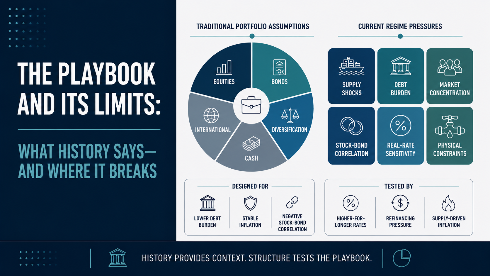
This article turns to the financial layer. The question is not simply which asset classes performed well during prior inflation shocks — that record is available. The harder question is whether the playbook built from that record still applies when the shock is occurring inside a different market structure: higher public debt, weaker sovereign credit standing, more concentrated equity indices, heavier passive flows, and a Treasury market that has not behaved like a reliable hedge in recent supply-driven episodes.
This is not investment advice. It is a review of the historical record and a test of the assumptions embedded in conventional portfolio construction.
Table of contents
The April 2026 inflation data released the second week of May completes the picture that Article 3 examined at the sector level. CPI at 3.8% and PPI at 6.0% — and the 220-basis-point gap between them — represent pipeline pressure that has entered the production chain but not yet reached consumer prices.[1][2]
Where the Data and Markets Stand
On May 14, the Bureau of Labor Statistics reported that import prices rose 4.2% year-over-year — the largest twelve-month advance since October 2022 — with fuel imports surging 16.3% in a single month. Nonfuel imports rose 2.9% year-over-year, also the highest since October 2022, indicating that the cost pressure extends well beyond energy. Export prices rose 8.8% year-over-year, with the BLS export air transportation services index rising 8.5% in a single month — up 4.6% year-over-year after being negative the prior month — the largest monthly gain since the series began monthly publication in January 2006.[3]
Financial markets are responding to the trends emerging in the data — but not uniformly, and not in the directions the conventional playbook would predict.
On May 13, the Treasury Department auctioned $25 billion in 30-year bonds at 5.046% — the first time the 30-year cleared above 5% at auction since 2007. By May 15, the yield had risen further to 5.13%. Federal debt today stands at approximately $39 trillion — 122% of GDP — up roughly 338% and nearly double the debt-to-GDP ratio that prevailed when 30-year yields last stood at this level in June 2007, when federal debt was roughly $8.9 trillion at approximately 64% of GDP. The bond market is asking the same nominal yield on a fundamentally different balance sheet.[4][5]
Commodities reflect the supply shock directly. Oil prices are up approximately 60% since the beginning of the Iran conflict and nearly 80% since the start of 2026. The S&P GSCI — a production-weighted index covering 24 commodities across energy, metals, agriculture, and livestock — has risen above its June 2022 pandemic-era high.[6][7]
Gold tells a more complicated story. Gold reached an all-time closing high of approximately $5,400 per ounce on January 28, 2026 — almost exactly one month before the Strait closure — capping a parabolic January rally driven by central bank purchasing, de-dollarization flows, fiscal sustainability concerns following the Moody’s downgrade of U.S. federal government debt, and tariff uncertainty. The rally ended abruptly on January 29 when the nomination of Kevin Warsh as Federal Reserve Chair triggered a hawkish repricing across rate-sensitive assets: gold fell more than 10% in two trading sessions as markets reassessed the interest rate trajectory. The Strait closure on February 28 produced a brief safe-haven spike, but the war’s inflationary implications ultimately reinforced the hawkish repricing — adding fuel to rate hike expectations rather than supporting gold. By mid-May, gold had settled near $4,520, approximately 16% below its January peak. The mechanisms driving that correction — and what they reveal about gold’s actual relationship to inflation versus real interest rates — are examined later in this article.[8]
The United States is a net energy exporter — with energy exports at record highs — which means the commodity at the center of the disruption is one the country produces in volume. In macroeconomic terms, this improves the trade balance and contributes positively to GDP.
But net exporter status is not the same as self-sufficiency. As Article 1 documented, crude oil is not a uniform commodity. The United States produces primarily light sweet crude, while the Gulf Coast refining complex — the infrastructure that produces the diesel, jet fuel, and petrochemical feedstocks the domestic economy depends on — is configured to process heavy sour crude, much of it historically sourced from the Middle East, Venezuela, and Mexico. Exporting light crude at record volumes does not resolve the feedstock constraint at the refinery. The trade balance improves; the input cost problem does not.
The net export contribution also flatters GDP as a summary statistic. In the national accounts, export revenue enters the calculation directly — but the cost transmission to domestic consumers and producers does not subtract from it on the same line. The distortion is not hypothetical or marginal: U.S. crude exports are at record highs at the same time the last vessel to transit the Strait of Hormuz — the tanker New Corolla, carrying 2 million barrels — docked at Long Beach on May 5. The country is simultaneously booking record export revenue and absorbing record input cost increases from the same commodity, and GDP registers only the first.[9]
And the benefit that does exist is not evenly distributed. U.S. energy production is privately owned. The revenue gains flow to energy companies and their shareholders, not to the federal budget or to consumers. American households and businesses still pay global commodity prices for gasoline, diesel, and every downstream petrochemical product.
This distinction matters for interpreting the equity market. The S&P 500 reached its eighteenth record high of 2026 the same week the inflation data printed. U.S. equities have outperformed other major developed-market indices in 2026 — but the explanation is a composite of two forces pulling in different directions. At the macro level, net exporter status provides a GDP advantage that energy-importing economies do not share. At the index level, the record highs are driven by the technology and AI infrastructure names that account for approximately 35% of the index, whose valuations still embed the growth projections and buildout timelines that the rest of this article examines.
The rise in yields is not confined to the United States. Japan’s 30-year yield hit 4.00% — an all-time record — and the UK 10-year reached 5.14%. The Swiss 10-year, by contrast, hovered near 0.4%, and the Swiss franc reached its strongest level against the dollar in eleven years, gaining nearly 13% over the prior twelve months. Capital is discriminating among sovereign issuers based on balance-sheet credibility and inflation exposure: the franc is absorbing flows that historically would have entered Treasuries or yen-denominated assets, while the dollar and the yen are both repricing under pressure from fiscal deficits and shifting monetary policy.[5]
Before the conflict, rate markets across G10 economies expected central bank policy rates to be unchanged or lower by year-end 2026.
Kevin Warsh was confirmed as Federal Reserve Chair on May 13 by a 54–45 vote. He will chair his first FOMC meeting on June 16–17. Despite an appointment widely expected to signal alignment with the administration’s preference for lower rates, markets have priced out all rate cuts for 2026 and are pricing approximately 50% probability of a rate increase by year-end. The policy direction under the incoming chair is uncertain, which is itself a market condition: bond markets, equity valuations, and currency flows are all pricing around a reaction function that has not yet been established.[10]
This is the environment in which the historical review that follows should be read: inflation accelerating across multiple vectors, bond yields at levels not seen in nearly two decades but against a debt load four times the size of the last comparable period, equities at records priced on trailing earnings that predate the depreciation, energy cost, and supply-chain pressures now entering the pipeline, gold correcting as rate expectations override safe-haven demand, commodities above their pandemic-era highs, a new and untested Fed leadership, and the U.S. in the unusual position of being a net exporter of the commodity at the center of the shock while remaining fully exposed to its cost transmission through the refining and petrochemical architecture the economy depends on.
What History Shows
The United States experienced two distinct stagflationary episodes in the 1970s and early 1980s: 1973–1975 and 1978–1982. Both were triggered by oil supply shocks — the 1973 OPEC embargo and the 1979 Iranian Revolution — that produced the same pattern described in this series: supply-driven cost pressure compressing margins across the real economy while monetary policy struggled to address both inflation and economic weakness simultaneously. The U.S. has experienced other inflationary periods — during and after both World Wars, and during the Korean War — but those occurred under different monetary regimes, different financial market structures, and a different economic base. The 1970s episodes are the closest comparison to today: a modern consumer economy, a floating exchange rate, and a Federal Reserve operating under its current dual mandate.[11]
The historical record organizes around three mechanisms that matter for understanding the current environment: how nominal returns masked real stagnation, why assets tied to the source of the shock outperformed, and how duration and high-multiple growth equities were punished.
Nominal returns masking real stagnation
The standard benchmark for conventional portfolio construction — 60% equities, 40% bonds — is often evaluated over the period from 1968 to 1987 when measuring performance during stagflation, because that window captures the full inflationary cycle: the lead-in, both acute episodes, and the recovery lag. Over that full period, $1,000 invested in a 60/40 allocation grew to roughly $4,300 in nominal terms — but adjusted for cumulative inflation, that $4,300 had the purchasing power of approximately $1,034 in 1968 dollars. The investor preserved nominal wealth but gained almost nothing in real terms over nineteen years.[12]
Why this happened requires understanding how the 60/40 portfolio is designed to work — and the specific condition under which it fails. The construction rests on a correlation assumption: when economic growth slows, stocks decline, but central banks cut interest rates to stimulate the economy, causing bond prices to rise. The negative correlation between stocks and bonds is what makes the portfolio function as a hedge. The embedded assumption is that equity declines are caused by demand weakness — the kind the Fed treats with rate cuts, which lift bonds. The 60/40 portfolio is not inherently flawed. It performed its designed function during demand-driven slowdowns when the Fed could cut rates to support bonds.
Supply-driven inflation breaks that assumption. When input costs surge, corporate margins compress, driving equities down. Simultaneously, central banks raise interest rates to combat inflation — the same tool that is supposed to support the bond side of the portfolio — driving bond prices down. Both sides can come under pressure from the same force. The negative correlation flips to positive, and the diversification mechanism fails.
The equity-only investor fared no better in real terms. The S&P 500, adjusted for inflation, did not sustainably recover its 1968 purchasing power for approximately twenty-five years. The inflation of the 1970s and early 1980s consumed nominal gains as fast as the market produced them — a lost generation of real equity returns. The diversified 60/40 investor recovered purchasing power roughly six years sooner — a meaningful benefit of diversification, but one that still required nineteen years to deliver.[12][13]
Assets tied to the source of the shock outperformed
The asset classes that gained purchasing power during these periods shared a common characteristic: they were directly linked to the commodities at the center of the price shock.
Commodities. The S&P GSCI — a production-weighted composite index covering 24 commodities across energy, precious metals, industrial metals, agriculture, and livestock — delivered a back-tested total return of approximately 586% over the 1970–1980 decade (the index was launched in 1991; all pre-launch performance is hypothetical, reconstructed from historical futures prices using the methodology in effect at launch). Agricultural commodities moved sharply: beef prices doubled, corn nearly tripled, and wheat quadrupled. Farmland appreciated from $137 per acre in 1970 to $737 per acre by 1980, a 438% gain, though direct farmland ownership is not available through conventional portfolio vehicles for most investors today.[14]
Energy equities. Energy equities returned approximately 15% per year from 1974 to 1980, compared to inflation running at roughly 8–10% annually — delivering approximately 5–7% in real terms while the broad market lost purchasing power. The companies that produced, refined, or transported the commodity at the center of the shock captured the price increases that compressed margins everywhere else.[15]
Gold also performed strongly during this period, but through a different mechanism — one driven by real interest rates and the end of the Bretton Woods peg rather than direct commodity exposure. That mechanism, its limitations, and what it implies for the current environment are examined in “Where Gold Stands in This Framework” later in this article.
Duration and high-multiple growth suffered
Bonds. Fixed coupon payments fell behind inflation year after year as prices rose faster than bond yields compensated. Treasury yields surged across the curve — the 10-year rose from approximately 6% in 1970 to over 15% by 1981 — but the damage was concentrated in long-duration bonds, where interest rate sensitivity is highest. In 1979 alone, long-term government bonds lost 8.6% in nominal terms. In real terms, long-duration bonds were among the worst-performing assets of the period.[16]
Growth equities. The “Nifty Fifty” — the premier growth names of the 1960s bull market, companies like Xerox, IBM, and Polaroid — declined 60–90% during the 1973–74 bear market. The mechanism operated through three channels simultaneously: rising input costs compressed corporate margins, rising interest rates compressed valuation multiples by increasing the rate at which future earnings are discounted, and rising borrowing costs increased the price of the debt financing that growth companies relied on to fund expansion. Growth stocks, whose valuations depend most heavily on discounted future earnings, absorbed the most severe combination of all three.[17]
Real estate. Physical real estate held directly generally kept pace with inflation during the 1970s. Modern publicly traded REITs do not replicate this behavior. The REIT structure has changed: higher leverage, mortgage-REIT dominance, and equity-market correlation destroy the inflation-hedging properties of the underlying physical assets. In 2022, VNQ (the Vanguard REIT ETF) lost 26.3%. Public farmland REITs lost 25–30%. Timber REITs dropped 19.4%. Private farmland continued appreciating during the same period. The vehicle matters as much as the asset class: owning real assets directly has historically provided inflation protection; owning them through leveraged, publicly traded structures typically has not.[18]
Trend-following
Trend-following is a systematic strategy that takes long and short positions across asset classes based on price momentum. Managed futures is the most common vehicle — a fund structure that trades futures contracts across commodities, currencies, bonds, and equity indices. When equities enter a sustained decline, the strategy can hold short equity positions and profit from the move; when commodities enter a sustained rally, it can hold long commodity positions. The strategy is not directionally committed — it follows whatever trends the market establishes.
The historical evidence base is extensive but requires careful distinction between backtested and live-traded results. A study by Hurst, Ooi, and Pedersen at AQR Capital Management reconstructed 137 years of trend-following returns (1880–2017) and found positive real performance in all eight U.S. inflationary regimes since 1926. The backtest is rigorous — but it is a backtest: the rules that generated those returns can be informed by the data being tested, and there is no way to know how markets would have behaved with a large participant operating those rules in real time.[19]
Live-traded evidence is more limited but concentrated in the periods that matter most. During the 2008 financial crisis, the Barclay CTA Index — a broad, equal-weighted composite of approximately 535 managed futures programs, backfilled to 1980 — gained approximately 14% while the S&P 500 fell approximately 38%. In 2022, the SG Trend Index — an equal-weighted composite of the 10 largest trend-following managed futures funds, published by Société Générale — returned approximately 27% while the S&P 500 fell 18% and the Bloomberg Aggregate dropped 13%. These are the strategy’s strongest selling points: real money, real crisis, positive returns when conventional portfolios were losing on both sides.[19][20]
The limitations are equally specific. Trend-following requires sustained directional moves to generate returns. It is reactive by design — it identifies trends after they have begun and exits after they have reversed, which means it tends to lag during sudden dislocations and perform during extended grinds. During the initial COVID crash in March 2020, the SG Trend Index gained just 1.1% — and only because it happened to be positioned long fixed income and the U.S. dollar going into the crash. The same strategy returned -4.2% during the August 2024 volatility spike, wrong-footed with long equity and dollar positions. The performance during rapid reversals follows no reliable pattern — it is positioning-dependent, not strategy-dependent. The honest framing is a “two-act” pattern: trend-following often struggles in Act I (the initial sharp move) and provides its value during Act II (the sustained directional grind that follows). The 2008 crisis ground down over months. The 2022 rate cycle was sustained over sixteen months. Both were Act II environments.[19]
The cost of the strategy is sustained underperformance outside of crisis periods. Since 2009, managed futures has had only two winning years through 2017 — the low-rate, Fed-backstopped era produced few sustained trends to follow. The SG CTA Index — a separate, equal-weighted composite of 20 managed futures programs — gained 4.8% annualized from January 2000 through May 2024, trailing stocks at 5.9%. No single managed futures composite covers all periods or fund sizes; this article uses whichever index has the most appropriate data for the specific claim. Trend-following beat stocks in only 35% of rolling three-year windows over that period. The rolling twelve-month return hit -18.6% in April 2025 — the worst ever recorded for the SG Trend Index — during tariff-driven market whipsaws. This is not a strategy that outperforms on average. It is portfolio insurance that costs the holder in calm markets and pays during specific conditions: sustained, directional moves across asset classes. The investor buying it needs to understand they are paying a premium most of the time for protection that activates under particular — not all — stress conditions.[19]
The most recent confirmation of the broader historical pattern came in 2022. The inflationary shock that year emerged from a different source — pandemic supply-chain disruptions compounded by Russia’s invasion of Ukraine and roughly $5 trillion in COVID-era fiscal stimulus — but produced the same asset class behavior. Energy equities returned approximately 59%, the only positive S&P 500 sector. The S&P GSCI rose approximately 26%. Managed futures gained approximately 27%. On the other side, the S&P 500 declined approximately 18.1%, bonds fell over 13% — the Bloomberg Aggregate’s worst calendar year since its inception in 1976 — and the 60/40 portfolio returned approximately -17.5%, its worst year since 1937. Gold was roughly flat, muted by the same real-rate mechanism that ended its 1980 rally: the Fed raised rates approximately 525 basis points in sixteen months, driving real rates sharply positive.[21][20][8]
The pattern held. The asset classes tied to the source of the shock outperformed. The asset classes dependent on low inflation and low interest rates were punished. The 60/40 portfolio failed because both sides declined simultaneously. The question is whether the pattern will hold again — and whether the structural environment surrounding this episode changes where the familiar mechanisms lead.
Where the Old Map May Not Apply
The 2022 episode confirmed the historical pattern — and revealed something the 1970s data showed only in reconstructed Ibbotson/SBBI returns: the stock-bond correlation turned sharply positive during supply-driven inflation. In 2022, that pattern appeared for the first time in the Bloomberg Aggregate Bond Index — the benchmark that modern 60/40 portfolios are actually built on. The diversification mechanism did not merely weaken — it inverted. That regime shift is documented in institutional research from AQR, PIMCO, and BlackRock, and its implications extend beyond a single calendar year.[20][22]
All three episodes — the 1970s, 2022, and the current Hormuz disruption — share the same mechanism: an energy supply shock propagating through input costs, compressing margins in the real economy while creating a policy dilemma for central banks. Some elements of the historical pattern appear to be repeating. What has changed is the market structure in which those dynamics are playing out. The conventional defensive playbook rests on two core assumptions: that broad equity index exposure provides diversification, and that Treasuries hedge economic stress. Both face pressure that did not exist during either prior episode — in the equity market through concentration and passive amplification, and in the bond market through fiscal constraints on the sovereign balance sheet.
The index is not the economy
Before examining the specific pressures on the companies that dominate an index, it is worth establishing the scale of the concentration and the economic assumptions it embeds.
Approximately three-quarters of the 2.0% U.S. GDP growth in Q1 2026 was attributable to AI and data center-related investment. The four largest hyperscalers — Amazon, Microsoft, Alphabet, and Meta — collectively committed to approximately $725 billion in capital expenditure for 2026, up 77% from the prior year’s record of $410 billion. Roughly 75% of that spending is targeted at AI infrastructure: GPUs, high-bandwidth memory, networking equipment, and the data centers to house them. Three of the four hyperscalers raised their 2026 guidance during Q1 earnings, and three pre-signaled that 2027 capex would be higher still — driven by both continued demand and the expectation that input costs will not normalize. Alphabet’s CFO explicitly warned that the increased spend would put pressure on the P&L through higher depreciation and energy costs. TSMC, in presentation materials disclosed May 15, 2026 — two and a half months into the Strait closure — raised its 2030 global semiconductor market forecast by 50%, from $1 trillion to $1.5 trillion, with AI and high-performance computing expected to represent 55% of that market. The revision was framed entirely as a demand story; TSMC did not address the supply constraints — helium depletion, Strait closure, component cost inflation — that this series documents.[23][24]
The “Magnificent Seven” — Apple, Microsoft, Alphabet, Amazon, Nvidia, Meta, and Tesla — collectively account for approximately 34.8% of the S&P 500 as of May 2026. The S&P 500 is weighted by market capitalization — each company’s share of the index is proportional to its total market value. A $3 trillion company occupies roughly 100 times the index weight of a $30 billion company. The index’s performance is dominated by whatever is largest, regardless of how the other 493 companies are doing.[25]
The Magnificent Seven contribute approximately 30% of total S&P 500 earnings — a higher fundamental contribution than the dot-com era’s top names (less than 20% in 2000), which means the current concentration is more earnings-supported. But market value concentration has outrun even that elevated earnings share. Broadening to the top ten names — which add Berkshire Hathaway, Broadcom, and JPMorgan Chase — the group represents approximately 41% of index weight while contributing approximately 32% of earnings. The additional three names add 6 percentage points of index weight but only 2 percentage points of earnings, meaning the concentration premium widens as the circle expands. The gap between what these companies are valued at and what they currently earn is the market’s bet on the buildouts proceeding on schedule, at scale, and at the cost structures originally modeled — conditions the next section examines.[23][25]
The S&P 500 Equal-Weight Index’s relative performance against the cap-weighted index has reached a twenty-year low — the median stock is lagging the largest names by the widest margin in two decades. Cap-weighted has outperformed equal-weighted by roughly 32% over three years, one of the largest divergences on record. In practical terms, an investor who owns the S&P 500 through a standard index fund is getting a return driven overwhelmingly by a handful of names. The other roughly 490 companies are collectively contributing less to the investor’s return than at any point in twenty years. This is a condition, not a timing signal — narrow leadership can persist for extended periods — but it means the index-level return increasingly reflects the performance of a small number of companies rather than the broad economy.[26]
The condition has precedent — though the parallel that applies depends on what you’re measuring. In March 2000, Information Technology accounted for over 33% of the S&P 500. The index peaked that month and did not recover its real value for roughly thirteen years. Today, Technology and Communications Services together account for approximately 46% — a combined figure because the 2018 GICS reclassification moved Alphabet and Meta from Technology to Communications Services, splitting what would have been a single tech-adjacent sector under the prior classification. The concentration is greater, but the earnings contribution is also greater — the question is whether the growth assumptions embedded in that concentration are realized.
For historical scale: the largest sector in the S&P 500 has typically accounted for roughly 15–28% of index weight. Energy peaked above 25% in the early 1980s. Technology exceeded 33% in March 2000. Financials reached 22% in 2007. Today’s combined 46% for Technology and Communications Services is outside any historical precedent.
The 2007 comparison operates differently. Financials accounted for 22.2% of the index — the largest sector weight — and the cap-weighted index continued to climb through October 2007, with the dominant sector’s performance masking the deterioration in market breadth underneath it. But in the 2003–2007 period, equal-weight was actually outperforming cap-weight — the opposite of today — because Financials included many companies broadly distributed across the sector, not concentrated in a handful of names. What 2007 illustrates is not the equal-weight signal (that parallel belongs to the late 1990s) but the sector-dominance risk: when the sector with the largest index weight is also the sector most exposed to the emerging stress, the headline index obscures the vulnerability until the repricing arrives. The exposure is not uniform — companies with large recurring revenue from software and services are less directly dependent on the physical supply chain than those whose revenue is tied to hardware manufacturing and semiconductor delivery — but all seven are valued, to varying degrees, on growth assumptions that require the buildout to proceed.[13][27]
What the capex commitments are running into
The market reads rising capex as a demand signal — evidence that the companies closest to AI see accelerating opportunity. A material portion of the increase is input cost inflation flowing through the same supply chain architecture. The pre-Q1-earnings baseline was $650–700 billion. Microsoft’s CFO attributed $25 billion of the increase to component cost inflation. Meta cited $10 billion in higher memory pricing. At least $35 billion of the headline increase to $725 billion is paying more for the same capacity, not buying additional capacity. The $725 billion buys roughly what $650 billion was supposed to buy.[28]
The physical system beneath the capex number is less abstract than the financial discussion usually acknowledges. A data center without chips is a warehouse. A semiconductor supply chain without helium is a bottleneck. A buildout financed at one cost structure but executed through another is not the same investment case.
The argument is not that AI demand disappears or that supply chains never adapt. Infrastructure revolutions have historically remained transformative while producing weaker-than-expected returns for early capital providers when construction costs, financing costs, and deployment timelines shifted simultaneously. The question is whether buildout assumptions formed under cheaper energy, cheaper memory, stable logistics, and uninterrupted semiconductor throughput still produce the same return profile under the cost structure now in place.
Component costs are already compressing the investment. Contracted Q2 2026 DRAM prices rose 58–63% quarter-over-quarter; contracted NAND flash prices rose 70–75% over the same period (TrendForce, March 31, 2026 — forward contract survey, not realized quarter-end figures). Memory alone will consume approximately 30% of hyperscaler data center spending in 2026, a fourfold increase from 2023. Microsoft warned that even with the additional investment, the company expects to remain capacity-constrained on GPUs, CPUs, and storage through at least the end of the year. UBS and Bank of America estimate that hyperscaler capital expenditure now runs at 94–100% of operating cash flow, compared to a ten-year average of approximately 40%.[28]
The physical supply constraint compounds the cost pressure. As documented in Article 2, the fabrication of advanced semiconductors requires helium — a gas with no commercially viable substitute at current production scales. Qatar, the world’s largest helium supplier, remains inaccessible due to the Strait closure. Samsung’s 6-to-12-week helium buffer, flagged in earlier reporting, approaches exhaustion in the June–July timeframe. The hyperscalers have commitments to buy semiconductor output that may not be fully manufactured at the projected volumes if helium supply does not normalize.[29]
The buildings themselves cost more to build. Data center construction faces the same cost pressures. Steel tariffs remain at 25%. Section 232 tariffs of 50% on semi-finished copper products and 25% on copper derivative products have been in effect since August 2025, restructured in April 2026. A Commerce Department update due by June 30, 2026 will inform whether additional phased tariffs on refined copper inputs — currently exempt — are imposed beginning in 2027. Copper — essential for wiring, transformers, and cooling systems, with a single hyperscale facility requiring tens of thousands of tonnes — is trading near $6.50 per pound, near record highs and up roughly 45% from early 2025 levels. Diesel is above $5 per gallon nationally and approaching $9 in California, up roughly 55% year-to-date. Construction labor commands 9–11% wage premiums in specialized trades. Concrete requires natural gas-fired kilns. Cable insulation, cooling system components, and structural sealants are petrochemical derivatives under the same feedstock pressure described in Article 1. The steel tariffs were in place before the hyperscalers set their 2026 budgets; the energy and logistics cost surge from the Strait closure arrived after.[30]
The cross-asset trap
The concentration does not stop at the equity index. To sustain capital intensity that now runs at 94–100% of operating cash flow, the same companies dominating the equity index are simultaneously becoming the largest issuers in the investment-grade bond market. Cambridge Associates estimates that gross U.S. investment-grade bond supply will rise approximately 25% to a record $2.25 trillion in 2026, driven in part by hyperscaler and infrastructure issuance rising to roughly $400 billion — approximately ten times what these companies raised in 2024. Meta, Oracle, Alphabet, and Amazon collectively raised over $100 billion in the fourth quarter of 2025 alone. JPMorgan projects $1.5 trillion in cumulative AI-related investment-grade debt over five years, a pace that would make the largest technology companies among the biggest corporate bond issuers in the market — Meta’s $30 billion offering in late 2025 was already the largest single corporate bond sale of the year.[31]
Amazon’s trailing twelve-month free cash flow has compressed to $1.2 billion (down 95% year-over-year). Oracle carries a $25 billion trailing free cash flow deficit. Investment-grade spreads remain relatively tight compared to multiple preceding decades — approximately 80 basis points over Treasuries, near the bottom of a historical range that has widened to 300 basis points or more during credit stress episodes and above 600 basis points during the 2008 financial crisis. At current levels, spreads have limited room to compress further and significant room to widen if conditions deteriorate.[31] The investor holding investment-grade corporate bonds at these spread levels is accepting the credit risk of the issuer while earning barely more yield than a Treasury — and if spreads revert toward historical averages, the price decline in the bond is the cost of that thin premium.
The implication for portfolio construction is direct. An investor who owns a cap-weighted equity index and attempts to diversify by holding a broad investment-grade corporate bond fund may be running a more correlated portfolio than they realize. The same companies that represent approximately 35% of the equity index are becoming a growing share of the corporate bond index. If the AI infrastructure buildout encounters delays, cost overruns, or lower-than-expected utilization, the repricing does not stay in one sleeve of the portfolio. It transmits across both — equity multiples contracting on reduced growth expectations, while corporate bond spreads widen on the same balance sheets.[31]
The quality composition of the index compounds the risk. BBB-rated bonds — the lowest rung of investment grade, one notch above junk — now represent approximately half of the U.S. investment-grade index, up from 25% in 1990. The decline in index credit quality has been almost entirely at the expense of AA-rated and above bonds, whose share has fallen from over 35% to less than 10% over the same period. PineBridge has noted that Single-A-rated hyperscaler paper has already cheapened to spreads previously requiring a BBB credit profile. If the buildout pressures documented in this article trigger downgrades, the forced selling by IG-mandate funds would arrive at exactly the moment liquidity is thinnest. The risk is compounded by a structural change in the index itself: the low-coupon bonds issued during the decade of near-zero rates extended the duration profile of the IG benchmark, making it more sensitive to interest rate increases than in any prior tightening cycle.[31][32]
The concentration is reinforced by a force that did not exist during prior stagflationary episodes. When Bogle launched the first index fund in 1976, passive investing was a rounding error. Today, passive vehicles account for roughly half of all U.S. equity fund assets. Capital flowing into a cap-weighted index mechanically buys more of whatever is already largest — amplifying concentration rather than reflecting a deliberate allocation decision. The same mechanism that amplifies concentration on the way up operates in reverse on the way down. And the index has become less exposed to the potential beneficiaries of input-cost inflation: the S&P 500 Energy sector has contracted from over 10% of the index to roughly 3.5%. The sector with the most direct exposure to the commodity at the center of the supply shock — and the strongest historical performance during prior episodes — has its smallest index weight in decades.[33]
The safety asset class was written for a different balance sheet
The argument is not that Treasuries have ceased to function as safe assets. They remain the deepest, most liquid sovereign debt market in the world, and foreign holdings reached a record $9.49 trillion in February 2026. Japan — the largest single foreign holder at $1.239 trillion — has maintained its position. No other bond market rivals the size, liquidity, and institutional depth of the U.S. Treasury market, and the dollar remains the world’s primary reserve currency.[34]
The narrower claim is that the degree of protection Treasuries provide during supply-driven inflation shocks appears less reliable than the playbook assumes — and that the fiscal environment surrounding the Treasury market has changed in ways that compound the problem.
The debt trajectory. U.S. federal debt stands at approximately $39 trillion — roughly 122% of GDP, the highest ratio since World War II and, unlike the post-war period, on a rising trajectory. The post-war economy had structural tailwinds that drove the denominator: roughly half the current population, strong union-driven wage growth, employer-provided pensions, and massive expansion still ahead in infrastructure, housing, and consumer markets. The debt ratio fell because GDP grew into it. Today’s denominator faces headwinds the post-war economy did not — water scarcity, energy competition, eroding safety nets, and the resource constraints the economy faces. Annual interest expense has reached approximately $1 trillion — 3.3% of GDP, roughly 14% of total federal spending, and 18.6% of federal revenues — making it the second-largest federal expenditure after Social Security. For comparison, when 30-year yields last stood at this level in 2007, federal interest consumed approximately 1.7% of GDP and roughly 8.5% of spending. Interest cost has roughly doubled as a share of both the economy and the budget while the yield has returned to the same nominal level — the difference is the balance sheet underneath it. The Congressional Budget Office projects debt could reach 134% by 2035, with persistent budget deficits of approximately 7% of GDP annually, potentially rising to 9% by 2034. Those projections assume near-full-employment and do not model the scenario in which the denominator contracts — in stagflation, the debt ratio accelerates from both directions as interest expense and automatic stabilizers push the numerator up while slowing GDP pulls the denominator down.[35]
The fiscal trajectory is not merely a projection. In 2020–2021, the federal government distributed roughly $5 trillion in direct stimulus — checks, enhanced unemployment, PPP — that created an unprecedented household savings buffer. That buffer absorbed the 2022 supply shock’s impact on consumer spending and is the primary reason the “stag” half of stagflation did not materialize. Federal debt was approximately $23 trillion when the CARES Act was passed. It stands at $39 trillion today. The fiscal capacity to repeat that intervention — to absorb a supply shock through household transfers at the same scale — is materially diminished. The constraint is compounded by the reserve diversification documented below: central banks that historically recycled surplus dollars into Treasuries are increasingly allocating to gold, reducing the structural demand that has allowed the U.S. to borrow at favorable rates during past crises.[21]
The interest rate dimension. A basis point is one hundredth of one percent (0.01%) — a unit so small it is invisible in everyday finance. On $39 trillion in debt, each basis point of higher rates costs the federal government approximately $3.9 billion per year once the full debt stock has rolled over at the new rate — a process governed by the weighted average maturity of approximately 70 months. The impact is not instantaneous: roughly one-third of marketable debt matures within 12 months, meaning approximately $48 billion in additional annual interest expense in the first year from a 50-basis-point increase on the refinancing wall alone. The remainder accumulates as longer-dated securities mature and reprice. At full rollover, a 50-basis-point increase translates to roughly $195 billion in additional annual interest expense. A 100-basis-point increase: $390 billion. Every dollar absorbed by interest is a dollar unavailable for infrastructure, agricultural support, healthcare funding, or disaster response. The tradeoff is already visible: the TBAC minutes from May 5 note that disbursements by the Environmental Protection Agency and the Federal Emergency Management Agency fell by $84 billion — a 17% reduction — in the same fiscal environment. FEMA coordinates federal disaster response and plays a role in food crisis management; the capacity to respond to the disruptions described in the previous articles is being reduced by the cost of servicing the debt those responses would add to.[36][37]
The credit downgrades. The United States has been downgraded by all three major credit rating agencies: S&P in 2011 (AAA to AA+), Fitch in 2023 (AAA to AA+), and Moody’s in May 2025 (Aaa to Aa1). The U.S. now ranks below peer nations that retain the highest ratings — Australia, Denmark, Germany — and among nations like South Korea, Austria, and France. The IMF has noted that if the U.S. dollar were not the world’s reserve currency, the credit rating could fall further. Fitch warned as recently as May 2026 that large fiscal deficits will keep the U.S. debt burden “far above that of other AA category sovereigns.”[38]
The erosion of the safety premium. The IMF stated in its April 2026 assessment that the increase in Treasury supply “is compressing the safety premium that U.S. Treasuries have traditionally commanded — an erosion that pushes up borrowing costs globally.” Research by Du, Keerati, and Schreger found that for every 10 percentage-point increase in the debt-to-GDP ratio, Treasury convenience yields decline by 4 to 9 basis points. State Street’s research found that long-duration Treasuries exhibit significant positive sensitivity to debt volatility — meaning that as fiscal sustainability becomes more uncertain, Treasuries are increasingly priced on fiscal risk rather than safe-haven attributes. More than half of bond strategists surveyed by Reuters expressed concerns about the traditional safe-haven status of U.S. Treasuries.[39]
The dollar’s declining reserve share. The U.S. dollar’s share of global foreign exchange reserves has declined to approximately 57–59%, a two-decade low. Central bank gold reserves have risen from roughly 13% to approximately 30% of total reserves over the same period. The shift is gradual but directional: the net trend among global reserve managers has been toward diversification, though the pace varies significantly by country and the dollar remains dominant. Each incremental reduction in reserve demand for Treasuries reduces the bid that has historically supported their prices during crises.[40]
The dollar’s reserve-share decline coexists with cyclical strength. The DXY index stands near 99, supported by rate differential expectations and the U.S. economy’s position as a net energy exporter — a relative advantage during a supply shock that penalizes energy importers. The reserve share erosion operates on a multi-year timeline; the dollar strength is cyclical. Both can be true simultaneously.[6]
The behavioral evidence. During the last three major market stress events — the post-pandemic inflation shock of 2022, the tariff disruption of early 2025, and the opening phase of the Iran conflict in 2026 — U.S. Treasury bonds declined alongside equities rather than rallying. In 2022, Treasuries fell even more than the Dow Jones Industrial Average.[41]
A fourth episode unfolded this week. As inflation data exceeded expectations across three consecutive releases — CPI on Tuesday, PPI on Wednesday, import prices on Thursday — the 30-year Treasury yield surged above 5% rather than rallying. Stocks rising while bonds sell off on inflation data is a different dynamic from 2022, when both fell together — but it is equally inconsistent with the negative correlation that portfolio construction assumes.
What the structural differences mean
The 1970s stagflation occurred with U.S. debt-to-GDP below 40%. Paul Volcker had fiscal room to raise rates to 20% — painful but survivable at that debt level. The arithmetic at today’s debt level is different. The distance between current rates (average 3.4% on outstanding marketable debt) and Volcker’s peak is approximately 1,600 basis points. The repricing mechanics documented above — $9.7 trillion in refinancing in fiscal year 2026 alone, with the remainder rolling over across the 70-month weighted average maturity — mean that even a fraction of that distance, realized incrementally as debt matures, would push annual interest expense toward levels that consume the majority of federal revenue. The arithmetic that made Volcker’s strategy survivable at 35% debt-to-GDP becomes materially more destabilizing at 122%.[42] The 1970s Treasury market carried an unchallenged safe-haven premium. The current market has been downgraded by all three agencies and has not consistently provided its traditional countercyclical hedge during the last three stress events.
The institutional transition compounds the uncertainty. Warsh will chair his first FOMC meeting on June 16–17, and the policy direction remains unestablished — the market cannot price the reaction function of a Fed that has not yet revealed one. Powell remains on the Board of Governors. The Fed funds rate stands at 3.50–3.75%.[10]
The Fed faces the classic dilemma that supply-driven inflation creates — raising rates worsens the economic deceleration and accelerates the debt service cost; lowering rates worsens the inflation — but with meaningfully less fiscal room to absorb the consequences of either choice. In the 1970s, the toolkit eventually worked: Volcker raised rates to 20%, caused a severe recession, and broke the inflationary cycle. The question is whether the same mechanism is available at 122% debt-to-GDP, with $1 trillion in annual interest expense, with three credit downgrades, with the dollar’s reserve share at a two-decade low, and with the largest foreign holder of Treasuries facing a domestic yield environment that may increasingly compete with dollar-denominated assets for institutional capital.
This does not mean Treasuries will fail in the next crisis. It means the historical precedent — “buy Treasuries when things get bad” — carries assumptions about fiscal conditions, sovereign creditworthiness, and market structure that no longer hold at the levels they did during prior episodes. The playbook was written for a different balance sheet.
Where Gold Stands in This Framework
Gold is often described as an inflation hedge. The historical record supports a more specific claim — and understanding the mechanism matters for evaluating gold’s prospects in the current environment.
Under the Bretton Woods system established in 1944, the U.S. dollar was pegged to gold at $35 per ounce and other major currencies were pegged to the dollar. By the late 1960s, the cost of the Vietnam War and Great Society spending programs had strained the U.S. commitment to maintain sufficient gold reserves to back dollars held abroad. In August 1971, President Nixon suspended gold convertibility, and the dollar became a free-floating fiat currency. Gold was free to trade at market prices for the first time in nearly four decades.[43]
The removal of the gold backing meant the Federal Reserve could expand the money supply without the constraint of maintaining gold reserves. The oil embargo that arrived in 1973 compounded this: an energy supply shock hitting an economy whose currency had just lost its anchor. Gold rose from approximately $35 per ounce in 1971 to a peak of roughly $850 in January 1980 — reflecting both inflation hedging and a broader repricing of what a dollar was worth without gold backing it.[43]
Measuring gold to its January 1980 peak overstates the case. The full stagflationary period extended through 1982. As Paul Volcker raised interest rates to historic levels, gold fell approximately 65% from its peak to roughly $300 by mid-1982. An investor who held gold from the end of the peg through the end of the second stagflationary episode still realized a gain of approximately 750% — but the trajectory reveals the mechanism that actually drives gold’s price. During this period, gold was driven primarily by real interest rates — the difference between the nominal interest rate and the inflation rate. When real rates are negative (inflation running above the rate earned on cash or bonds), gold benefits because interest-bearing assets lose purchasing power. When real rates are sharply positive (as under Volcker, when the fed funds rate reached 20% against inflation of roughly 10%), gold suffers because cash and bonds offer positive real returns while gold pays no yield.[43]
The most widely cited study of gold during inflationary regimes — Neville, Draaisma, Funnell, Harvey, and Van Hemert (2021) — found that gold ranked first among all asset classes in real annualized returns across eight inflationary episodes since 1926. The finding is real but narrow: gold was pegged at a fixed price or illegal to own privately during the first four episodes, so the result is driven by roughly one decade of freely traded data during the 1970s. It is evidence, not a guarantee — and the conditions that produced that decade’s returns were not identical to today’s.[44]
In 2022, gold was roughly flat — muted compared to the 1970s because real interest rates rose sharply as the Fed hiked approximately 525 basis points in sixteen months. The same real-rate mechanism was at work: when the Fed raises rates faster than inflation, real rates go positive, and gold underperforms.[8]
The pre-war rally that carried gold to a closing high near $5,400 in late January 2026, the hawkish repricing triggered by the Warsh nomination, and the subsequent correction to approximately $4,520 by mid-May are described in “Where the Data and Markets Stand.” Two forces are pulling in opposite directions.
The structural force supporting gold is central bank purchasing. When a central bank sells Treasuries and buys gold, it replaces a dollar-denominated, counterparty-dependent asset with a physical asset that cannot be frozen by any government — de-dollarization in its most concrete form. That shift accelerated after the freezing of Russia’s approximately $300 billion in reserves in 2022, and has been running at approximately 1,000+ tonnes per year since, roughly double the pre-2022 pace. In Q1 2026, central banks net-purchased 244 tonnes, consistent with this elevated trend. This purchasing provides a structural floor that did not exist during gold’s 1980 peak.[8]
A second force could reinforce the structural bid. The dollar has remained relatively stable during the conflict, supported by the U.S. position as a net energy exporter. But that stability reflects a balance between near-term advantages and the longer-term erosion of dollar demand documented in the preceding section. If the balance shifts — through fiscal deterioration, accelerating reserve diversification, or a narrowing of the rate differential that currently supports the dollar — the resulting dollar weakness would add a tailwind to gold that the current price does not reflect.
The cyclical force working against gold is the real-rate mechanism. If the Fed hikes rates significantly — which the market is pricing at roughly 50% probability for 2026 — gold faces the same headwind that produced the 65% decline from its 1980 peak. Gold’s performance from here depends substantially on whether the Fed can execute an aggressive tightening at 122% debt-to-GDP — the question the preceding section examined in detail. If the fiscal constraints on rate hikes are real, real rates may not rise enough to overcome the structural purchasing. If the Fed hikes aggressively regardless, the 1980 pattern reasserts itself.[8]
What This Means — and What It Does Not Mean
Across both the 1970s and 2022, asset class performance during supply-driven inflation organized around a consistent mechanical logic. The asset classes that preserved or grew purchasing power were those that captured cash flows directly from the source of the price shock — energy equities, commodities, trend-following strategies that could profit from sustained directional moves in either direction. The asset classes that lost purchasing power were those whose values depend on low inflation and low interest rates — long-duration bonds, high-multiple growth equities, and the portfolios constructed from them.
The analysis in this article suggests that some elements of the historical pattern are better positioned to repeat than others — and that the current environment introduces additional complications that did not exist during prior episodes.
The mechanisms that historically favored energy equities, commodities, and trend-following are present again: the companies that own the constrained resource capture the margin; the companies that must buy it absorb the compression. Trend-following strategies have live-traded evidence of positive performance during the 2008 crisis and the 2022 shock — but the evidence also shows the strategy is reactive to reversals, unreliable during sudden dislocations, and underperforms in most non-crisis periods. It is portfolio insurance with a carrying cost, not a consistent return source. Gold carries strong historical performance and is supported by central bank de-dollarization purchasing, but remains vulnerable to the real-rate mechanism that has driven its largest historical declines — and which side of that mechanism prevails depends on fiscal constraints that are themselves uncertain. Short-duration bonds, TIPS, and cash preserve capital in nominal terms or provide inflation linkage, but carry their own limitations: TIPS share the same sovereign credit exposure as conventional Treasuries, and cash loses purchasing power to inflation over time.
The mechanisms that historically impaired long-duration bonds and growth equities are also present, but the current environment adds layers of risk that did not exist before. The equity index is concentrated in a handful of companies whose growth projections depend on an AI infrastructure buildout that is running into the physical supply-chain constraints documented in this series — and that concentration is amplified by passive flows that mechanically overweight the largest names regardless of underlying conditions. The same companies dominate both the equity index and an increasing share of the investment-grade bond market, creating cross-asset correlation that conventional diversification does not account for. And the Treasury market carries the weight of a sovereign balance sheet — 122% debt-to-GDP, three credit downgrades, an eroding safety premium, a declining reserve share — that limits the Fed’s ability to use the interest rate mechanism that resolved prior inflationary episodes.
The historical lesson is not that any single asset class is guaranteed to protect purchasing power. It is that the asset classes that dominate conventional portfolios — broad equity indices and long-duration bonds — are the ones that have been most vulnerable during prior episodes, and that the conditions identified in this article suggest additional headwinds beyond the historical pattern. The asset classes with the strongest historical performance during these periods tend to be underrepresented in conventional allocations, in part because those assets underperformed during the low-inflation growth environment of 2009 to 2021.
This is not a prediction of collapse. The range of outcomes remains wide. Corporate adaptation, regional buffers, and policy responses are real and ongoing — the previous articles documented where each is underway. The claim is narrower: the two pillars of conventional portfolio construction — broad equity diversification and Treasury hedging — carry assumptions about index composition, fiscal capacity, sovereign creditworthiness, and asset correlation that the current environment is testing. Those assumptions may hold. They may not. The historical record provides a guide but not a guarantee, because the conditions are not identical to any prior episode. The future is not written. Readers should plan for the range, not for either endpoint.
Notes
[1] BLS, “Consumer Price Index — April 2026,” USDL-26-0721, May 12, 2026.
[2] BLS, “Producer Price Indexes — April 2026,” USDL-26-0723, May 13, 2026. The 220-basis-point PPI-CPI gap is documented in Article 3 of this series.
[3] BLS, “U.S. Import and Export Price Indexes — April 2026,” USDL-26-0724, May 14, 2026. Import prices +1.9% MoM, +4.2% YoY. Fuel imports +16.3% MoM. Nonfuel imports +0.8% MoM, +2.9% YoY. Export prices +3.3% MoM, +8.8% YoY. Export air transportation services index +8.5% MoM (largest since series began monthly publication January 2006).
[4] U.S. Treasury Department, 30-year bond auction results, May 13, 2026. $25 billion at 5.046% — first above 5% at auction since 2007. Reported via Financial Times, Bloomberg.
[5] Japan 30-year yield at 4.00% (all-time record) from Trading Economics / Bank of Japan data, May 15, 2026. UK 10-year at 5.14% from Financial Times. U.S. 30-year closing yield 5.12–5.13% on May 15 from CNBC, Yahoo Finance. Swiss 10-year at approximately 0.4% from Swiss National Bank data. Swiss franc gained nearly 13% against the dollar over the prior year, reaching an eleven-year high. 2007 federal debt approximately $8.9 trillion at approximately 64% of GDP from Peter G. Peterson Foundation and Treasury Department historical data.
[6] U.S. Department of the Treasury, Report to the Secretary of the Treasury from the Treasury Borrowing Advisory Committee (TBAC letter), May 5, 2026. Oil prices up ~60% since Iran conflict, nearly 80% since start of 2026; broad commodity index above pandemic-period high; “significant hawkish repricing of central bank policy”; “positive terms-of-trade shock for the US”; U.S. energy exports at record highs.
[7] S&P GSCI at 762.24 (spot index, May 19, 2026) from Yahoo Finance. iShares GSG ETF YTD +48.07%. “Broad commodity index above pandemic-period high” from TBAC letter to Treasury Secretary, May 5, 2026.
[8] Gold closing high approximately $5,400 on January 28, 2026 from JM Bullion / LBMA data. Warsh nomination triggered correction January 29; gold fell >10% in two sessions. Current approximately $4,520 mid-May 2026. Central bank net purchases of 244 tonnes in Q1 2026 from World Gold Council, “Gold Demand Trends,” Q1 2026. Annual central bank gold purchases approximately 1,000+ tonnes since 2022. Russia reserve freeze of approximately $300 billion in 2022 widely reported.
[9] The last vessel to transit the Strait of Hormuz, the tanker New Corolla, docked at Long Beach, California on May 5, 2026. Documented in Article 3 of this series. CBS Los Angeles, May 5, 2026; ABC7 Los Angeles, May 4, 2026.
[10] Kevin Warsh confirmed as Federal Reserve Chair by 54–45 Senate vote, May 13, 2026. First FOMC meeting scheduled June 16–17. Market pricing from CME FedWatch. Fed funds rate at 3.50–3.75%.
[11] Prior U.S. inflationary periods identified in academic literature. See Neville et al. (2021) for the complete regime identification.
[12] The 60/40 portfolio’s 19-year real return (1968–1987) calculated from S&P 500 total return and long-term Treasury bond returns adjusted for CPI inflation. Historical return data from S&P Dow Jones Indices, FRED/Federal Reserve Bank of St. Louis, and Bureau of Labor Statistics.
[13] S&P 500 real purchasing power recovery from the 1968 peak took approximately 25 years; the 60/40 portfolio recovered approximately six years sooner. Calculated from S&P 500 total return adjusted for CPI. The 2000 peak to real recovery took approximately 13 years. Technology sector weight exceeding 33% in March 2000 from S&P Dow Jones Indices.
[14] S&P GSCI total return of approximately 586% during 1970–1980. The S&P GSCI was launched April 11, 1991; all pre-launch performance is hypothetical back-tested. Farmland appreciation $137/acre to $737/acre from USDA Economic Research Service. Agricultural commodity prices from USDA NASS.
[15] Energy equity returns 1974–1980 from S&P Dow Jones Indices historical sector return data. CPI inflation averaged approximately 8–10% annually from BLS/FRED.
[16] Treasury yields from FRED, Federal Reserve Bank of St. Louis. Long-term government bonds lost 8.6% in 1979 from State Street Global Advisors.
[17] S&P 500 real return near zero for the 1970s decade from S&P Dow Jones Indices adjusted for CPI. Nifty Fifty declines of 60–90% during 1973–74 documented in Siegel, J., Stocks for the Long Run, 5th ed., McGraw-Hill, 2014.
[18] VNQ -26.3% from Vanguard Real Estate ETF fund fact sheet. Timber REIT (WOOD) -19.4%. Private farmland from USDA ERS and NCREIF Farmland Index.
[19] Hurst, B., Ooi, Y.H., and Pedersen, L.H., “A Century of Evidence on Trend-Following Investing,” AQR Capital Management, 2017. Barclay CTA Index +14.09% in 2008. SG Trend Index from Société Générale Prime Services, approximately +27% in 2022. COVID March 2020: SG Trend Index +1.1%. August 2024: -4.2%. SG CTA Index 4.8% annualized 2000–2024, trailing stocks at 5.9%, from Morningstar.
[20] S&P 500 total return approximately -18.1% in 2022 from S&P Dow Jones Indices. Bloomberg U.S. Aggregate Bond Index approximately -13%. 60/40 portfolio return approximately -17.5% from JPMorgan Asset Management — worst since 1937.
[21] COVID-era fiscal stimulus: CARES Act ($2.2 trillion), Consolidated Appropriations Act ($900 billion), American Rescue Plan ($1.9 trillion) — aggregate approximately $5 trillion. Excess household savings from Federal Reserve Bank of San Francisco research.
[22] The stock-bond correlation regime change is documented in Brixton et al., “A Changing Stock–Bond Correlation,” Journal of Portfolio Management, Vol. 49, No. 4, 2023 (AQR). Positive stock-bond correlation during the 1970s documented using Ibbotson/SBBI data in Verdad Capital, “An Update on the Stock-Bond Correlation,” October 2023.
[23] Hyperscaler capex of approximately $725 billion (2026) from BNP Paribas via CNBC, May 13, 2026. 77% increase from 2025’s $410 billion. 75% of spending targeted at AI infrastructure from CreditSights and Futurum Group.
[24] TSMC 2030 global semiconductor market forecast of $1.5 trillion from TSMC investor communications via Raymond James “Up & Adam,” May 15, 2026.
[25] Magnificent Seven at approximately 34.8% of S&P 500 as of May 12, 2026. Top 10 at approximately 41% of index weight from RBC Wealth Management, “The Great Narrowing,” January 2026, and Goldman Sachs research.
[26] S&P 500 Equal-Weight Index relative performance at twenty-year low from S&P Dow Jones Indices data. Cap-weighted outperformed equal-weighted by approximately 32% over three years from RBC Wealth Management.
[27] January 2007 S&P 500 sector weights: Financials 22.2%, Information Technology 15.1%, from S&P Dow Jones Indices historical data. Current Technology + Communications Services at approximately 46%.
[28] Microsoft $25 billion in component cost inflation from Microsoft FY2026 Q3 earnings call, CFO Amy Hood, April 30, 2026. Meta raised capex range by $10 billion from Meta Platforms Q1 2026 earnings call. DRAM +58–63% QoQ, NAND +70–75% QoQ from TrendForce, March 31, 2026. Memory ~30% of data center spending from CreditSights. Hyperscaler capex at 94–100% of OCF from UBS and Bank of America.
[29] Helium supply chain constraints documented in Article 2 of this series. Samsung 6–12 week helium buffer from TrendForce and Fortune. See also Article 2, footnote 28.
[30] Steel tariffs: Section 232 (March 2018). Copper tariffs: CRS Report IN12614. Copper ~$6.50/lb from Trading Economics. Diesel data from EIA. Construction labor premiums from AGC-NCCER (cited in Article 3).
[31] Cambridge Associates, “2026 Credit Outlook,” March 2026. IG supply rising ~25% to record $2.25 trillion. JPMorgan projection of $1.5 trillion cumulative AI/data center IG debt from PineBridge Investments, “2026 Fixed Income Perspectives,” February 2026. IG spreads ~80bp OAS from Bloomberg/ICE BofA indices.
[32] BBB share of U.S. IG index ~50%, up from 25% in 1990. Bank for International Settlements, “The increasing risk of investment grade indices,” September 2022. PineBridge observation from “2026 Fixed Income Perspectives,” February 2026.
[33] Passive fund share ~50% from Morningstar and Investment Company Institute. S&P 500 Energy sector weight ~3.5%.
[34] Total foreign holdings at record $9.49 trillion from Reuters, citing Treasury International Capital (TIC) data. CRS Report RS22331, “Foreign Holdings of Federal Debt.”
[35] U.S. debt ~$39 trillion from Peter G. Peterson Foundation. Interest expense from CBO February 2026 Budget and Economic Outlook. 2007 interest from FRED and CBO historical data.
[36] Interest rate sensitivity: $3.9 billion per basis point. Author calculation based on Treasury Debt to the Penny and CBO interest rate sensitivity analysis.
[37] Minutes of the Meeting of the Treasury Borrowing Advisory Committee, May 5, 2026. Other outlays fell by 17% ($84 billion), primarily due to reduced EPA and FEMA disbursements.
[38] S&P downgrade 2011, Fitch 2023, Moody’s May 2025. U.S. ranking from PGPF, March 2026. IMF Fiscal Monitor, April 2026. Fitch warning from Fortune, May 3, 2026.
[39] IMF Fiscal Monitor, April 2026 — convenience yield statement. Du, W., Keerati, R., and Schreger, J., “On the Safety of U.S. Treasuries,” working paper, 2024 (Harvard/IMF). State Street Global Advisors, “The Great Repricing,” 2026.
[40] Dollar reserve share decline from IMF COFER data. Central bank gold reserves from World Gold Council.
[41] Treasuries declining alongside equities during 2022, early 2025, and 2026 from Bloomberg data reported via Advisor Perspectives, April 29, 2026.
[42] Weighted average maturity ~70 months from Joint Economic Committee, U.S. Senate. Average interest rate 3.373% as of April 2026 (JEC). ~33% of debt matures within 12 months. Treasury must refinance $9.7 trillion in FY2026 (GAO Report GAO-26-107529).
[43] Bretton Woods system established 1944. Dollar-gold peg at $35/oz suspended August 15, 1971. Executive Order 6102 (1933) prohibited private gold ownership; lifted by Executive Order 11825 (1974). Gold price data from World Gold Council.
[44] Neville, Draaisma, Funnell, Harvey, and Van Hemert, “The Best Strategies for Inflationary Times,” Journal of Portfolio Management, Vol. 47, No. 8, August 2021. The study covers 1926–2021 and identifies eight inflationary regimes.
Material created in part with the assistance of AI. The foregoing information has been obtained from sources considered to be reliable, but we do not guarantee that it is accurate or complete, it is not a statement of all available data necessary for making an investment decision, and it does not constitute a recommendation. Any opinions are those of Mississippi Sound Financial Planning, LLC and not necessarily those of Raymond James.